Paper Decoration Color Matching: How to Keep a Seasonal Collection Consistent
Struggling with paper decoration color matching can be incredibly frustrating. You spend months designing the perfect seasonal collection, only to worry that the festive red honeyc

Struggling with paper decoration color matching can be incredibly frustrating. You spend months designing the perfect seasonal collection, only to worry that the festive red honeycomb balls won't match the red of the paper trees. When colors clash, it can cheapen your entire retail display and damage your brand's image. The solution isn't just finding the right color code; it's about implementing a robust quality control process from the very start.
Achieving color consistency in a paper decoration collection is managed through a multi-stage verification process, not by simply providing a Pantone code. The essential steps include establishing a physical master color standard, approving dyed paper samples (lab dips), verifying a final pre-production sample against the standard, and checking batch samples during mass production. This process ensures all components of a collection align, regardless of material differences or production runs.
While this might sound a bit formal, each step is a critical checkpoint designed to save you from costly headaches and unsellable inventory. So, let's dive into why a simple Pantone code often falls short and what a professional color management process actually looks like when you're sourcing paper decorations.
Why Isn't a Pantone Code a Guarantee for Color Consistency?
You've done your homework. You’ve picked the perfect Pantone color for your Christmas collection and sent the code to your supplier, expecting a perfect match. But when the first samples arrive, the color just looks... off. What went wrong?
A common misconception we see with new buyers is treating a Pantone code as a final command rather than a starting reference. A Pantone number is a recipe for an ink, but the final color you see is the result of that ink interacting with a specific material under specific light.
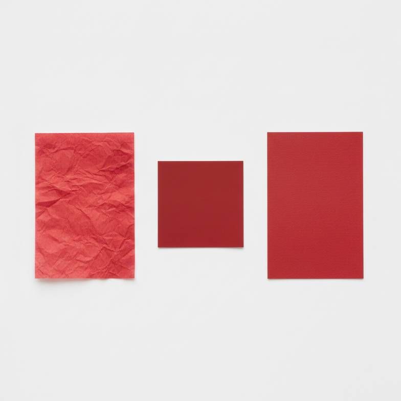
The Impact of Paper Stock and Finish
Think of it like painting a wall. The same can of paint will look completely different on a smooth, primed surface compared to a raw, porous piece of wood. Paper works the same way. The two most common finishes have a huge impact on color appearance:
- Uncoated Paper: This paper has a natural, matte finish and is more absorbent. Colors applied to it often appear slightly softer, darker, and less saturated because the ink soaks into the fibers. Many of our classic honeycomb decorations use dyed tissue paper, which is a great example of an uncoated material.
- Coated Paper: This paper has a layer of sealant applied during its production, which can be glossy or matte. This coating prevents the ink from soaking in as much. As a result, colors appear crisper, brighter, and more vibrant. This is common in heavier paper stocks used for things like packaging or certain structural decorations.
If your collection includes a lightweight honeycomb ball (uncoated) and a heavy cardstock star (coated), they will not look the same even if made with the exact same ink formula. A good manufacturer must adjust the color formulation for each paper type to match a single, approved master color standard.
The Lighting Factor in Retail Displays
Another thing sourcing teams often overlook is the context where the product will be seen. A color you approve in your office under cool-white fluorescent bulbs can look completely different under the warm, yellow-toned spotlights of a retail store.
This phenomenon is called metamerism. It's where two colors appear to match under one light source but look different under another. I've seen buyers approve a beautiful, cool-toned gray sample in their office, only to find it looks brownish and dull in their store. For this reason, we always advise clients to review final samples under lighting conditions that are as close as possible to the final retail environment.
What Does a Professional Process for Paper Decoration Color Matching Look Like?
If a Pantone code is just the beginning, what's the full story? Relying on hope and a single code can lead to disaster, like receiving an entire container of decorations where your brand's signature blue looks like three different shades.
A professional paper decoration color matching process is a structured, multi-step journey. At our company, we guide every wholesale and private label client through these stages. It’s a collaborative effort that protects both the buyer and the manufacturer by setting clear expectations.

This process is built on a series of approvals. You, the buyer, are in the driver's seat.
- The Master Standard: Your Single Source of Truth
This is the most important piece of the puzzle. The Master Standard is the one physical object that defines your target color. It is the "gold standard" that everything else will be compared against. It can be:
- A swatch from a Pantone book (e.g., a TCX fabric swatch is often better than a paper chip because it's larger and more durable).
- A piece of painted plastic or wood.
- A previously produced item that you want to replicate exactly.
The key is that it's a physical sample, not a digital code. This standard is what you and your manufacturer agree on before any production begins.
- Lab Dips: The First Material Check
Once the Master Standard is approved, we create "lab dips." These are small swatches of the actual paper stock for your product, dyed to match the Master Standard. We typically prepare several options (e.g., one that's a perfect match, one slightly lighter, one slightly darker) and send them to you for approval. This is the first and most critical checkpoint. It confirms we can achieve your color on your chosen material. Approving a lab dip gives us the green light to order the raw materials.
- The Pre-Production Sample (PPS): The Final Dress Rehearsal
After you approve a lab dip, we create a Pre-Production Sample. This is one complete, finished product made with the approved paper from the lab dip stage. The PPS is your chance to see the final item—shape, size, construction, and color—before we start mass production. You should compare the PPS directly against your original Master Standard under your target lighting. Approving the PPS is your final sign-off that authorizes the factory to begin manufacturing your full order.
- In-Production Batch Samples: Ensuring Consistency
For large orders, color can sometimes "drift" slightly during a long production run. To prevent this, we pull random samples from the production line at set intervals. We check these against the approved PPS and the Master Standard to ensure the 10,000th piece looks just as good as the first. For critical programs, we can send these batch samples to our clients for their own peace of mind.
How Do You Manage Paper Decoration Color Matching Across Multiple Products or Suppliers?
Managing color for one product is straightforward. But what happens when your seasonal collection has honeycomb balls, paper garlands, and printed tabletop signs—potentially sourced from different materials or even different factories? This is where many programs go off the rails.
When sourcing a complex collection with multiple components, your buyer-approved Master Standard becomes the single most powerful tool for ensuring consistency. Every supplier and every material must be calibrated against this one physical reference, eliminating the guesswork that comes from relying on digital codes alone.

Establishing a Single Source of Truth for All Partners
If you are working with multiple suppliers for one collection, you must take control of the color standard. Don't just send each supplier a Pantone code. Instead, you should:
- Approve one Master Standard: Pick one physical sample that represents your target color perfectly.
- Distribute Physical Samples: Cut your Master Standard into pieces and send one piece to each supplier. This becomes their target to match.
- Demand Matching Lab Dips: Require each supplier to provide lab dips on their specific materials that match the piece of the Master Standard you sent them.
This creates a hub-and-spoke system with your Master Standard at the center. It's the only way to ensure that the paper from Factory A matches the cardstock from Factory B. As a manufacturer, we often help our clients manage this, coordinating with other suppliers to ensure our paper decorations fit seamlessly into their broader collection.
Single vs. Multi-Factory Sourcing Strategy
Your sourcing strategy has a direct impact on how easy it is to manage color. Here’s a simple breakdown of the pros and cons:
| Sourcing Approach | Pros | Cons | Best For... |
|---|---|---|---|
| Single-Factory Sourcing | Greatly simplified color control; consistent material batches; easier communication. | Less product diversity; dependency on one supplier's capabilities. | Focused collections, private label brands wanting high consistency. |
| Multi-Factory Sourcing | Access to a wider variety of products and specializations; potential cost advantages. | High risk of color variation; requires intense project management from the buyer. | Large retailers managing complex, multi-category seasonal programs. |
Even when working with a single factory like us, a collection might use different paper types. For example, a delicate honeycomb ornament might use 80gsm tissue paper, while a matching foldable paper stool requires 400gsm reinforced cardstock. In this case, we would still create separate lab dips for each material, all matched back to your one Master Standard.
Frequently Asked Questions
How much color variation is commercially acceptable?
This really depends on your brand standards. For most retail applications, the goal is that any minor variation is not noticeable to the end consumer when the products are displayed together. The standard should be agreed upon when you approve the Pre-Production Sample. Any production unit that deviates significantly from that approved sample may be considered a defect.
Can I just use a CMYK or RGB code?
No. These color models are not suitable for manufacturing physical goods from raw materials. RGB (Red, Green, Blue) is for digital screens that emit light, while CMYK (Cyan, Magenta, Yellow, Black) is for printing ink on paper. Dyeing paper pulp or creating colored paper stock is a completely different process. Always start with a Pantone code (like Pantone C/U or TCX) or a physical object as your standard.
What if my samples don't match?
This is a normal and necessary part of the quality control process! If a lab dip or pre-production sample doesn't match your Master Standard, you should reject it and provide clear feedback. A good manufacturing partner will not push back; they will appreciate the clear direction and will rework the sample. This feedback loop is what prevents bigger problems later on.
How does lighting affect my final display?
Lighting has a huge impact. Two reds that match perfectly under factory lighting can look completely different under the warm spotlights in a store. We strongly recommend you evaluate your final Pre-Production Samples under lighting that simulates your actual retail environment to avoid any surprises.
Conclusion
Ultimately, successful paper decoration color matching is less about finding a magic color code and more about embracing a hands-on verification process. It requires clear communication and partnership between you and your manufacturer. By shifting your focus from simply providing a Pantone number to actively managing the approval process—from the Master Standard to lab dips and pre-production samples—you take control of your collection's quality and consistency. This proactive approach protects your brand's vision, ensures a beautiful and cohesive retail presentation, and prevents the costly risk of receiving a container of mismatched products.
If you are planning a seasonal collection and want to ensure color consistency across the board, our team can guide you through this professional sourcing and verification process. Contact us to discuss your project and learn how we manage color quality from start to finish.